


The Ultimate Last Minute Designer's Gift Guide
Curated Typefaces That Scream "I Get You"


Let's be real: designers can be the most impossible people to shop for. We're picky, we're passionate, and we have strong opinions about things most people don't even notice. But there's one universal truth in the design world – no designer has ever said, "Nope, I've got enough fonts."
The Typography Love Language
Fonts aren't just letters. They are personality, emotion, and visual storytelling packed into carefully crafted shapes. For designers, a perfect typeface is like finding a soulmate – it just clicks. And finding that perfect font? Pure magic.
Pro Tip: Gifting Fonts 101
Before we dive into our curated list, a few insider tips:
Font licenses can be expensive (some cost thousands!)
Look for "Font Starter Packs" for budget-friendly options
Start with 1-2 weights if you can't swing the full family
When in doubt, ask your designer friend which foundry they love
The Noise 13 2024 Font Wishlist
Our design team has spoken. These aren't just fonts – they are the start of creativity.
Dava's Picks (Founder & Chief Creative Officer)
Tomato Grotesk from The Designers Foundry
Fun, bold, versatile, and the counter space in the “a” is OH-SO-Pretty.
“Tomato Grotesk is a modern grotesk family with simple geometric shapes and accentuated contrast that give it a strong display like personality. High contrast, tight spacing and ink traps make it perfect for use in print and on screens in small sizes.” - TDF
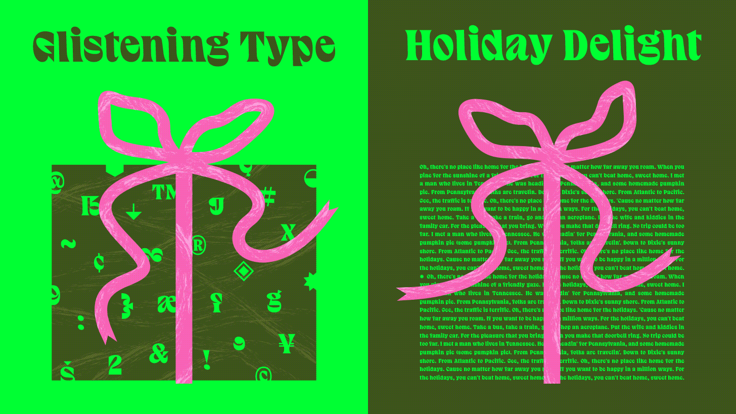
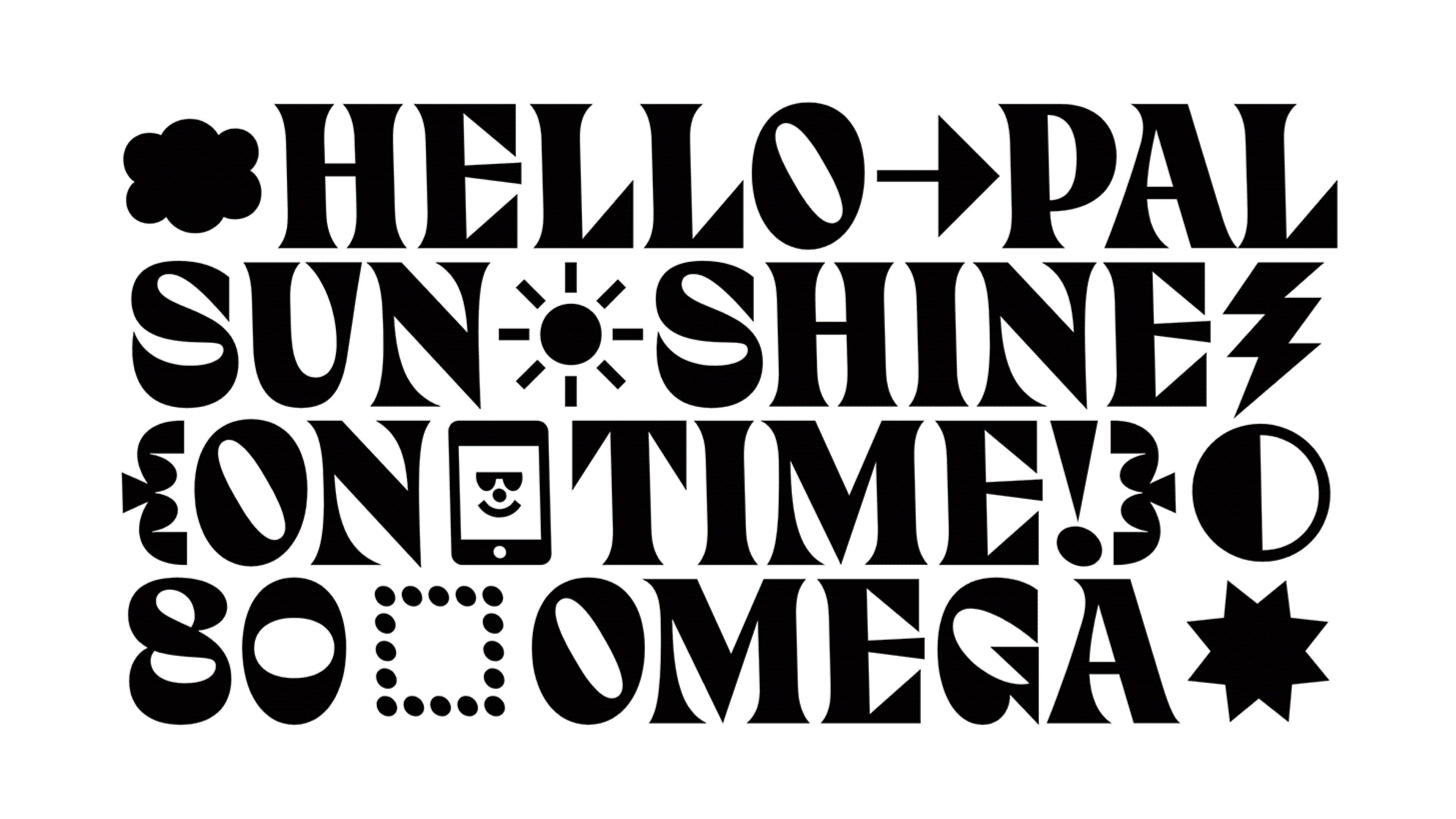
Central Avenue from Colophon Foundry
One word: BOLD. It has a historical feel without losing its Modernity. And don’t sleep on its glyph set, especially the Arrows. Gor-ge-ous.
“Central Avenue was originally created for the graphic identity of an exhibition celebrating Birmingham’s infamous 1886 exhibition of Local Manufacturers and Natural History. The core identity of the typeface stems from the bespoke design based on the hand-painted signs from the original 1886 exhibition.” - Colophon Foundry

Bonus Pick: Domaine Collection from Klim Foundry
“Domaine is a sharp, elegant serif that blends traditional French and British genres into a contemporary aesthetic. Its curvaceous Latin detailing centres upon gently bracketed triangular serifs, complemented by distinctive hooked terminals.”
Andre's Picks (Associate Creative Director)
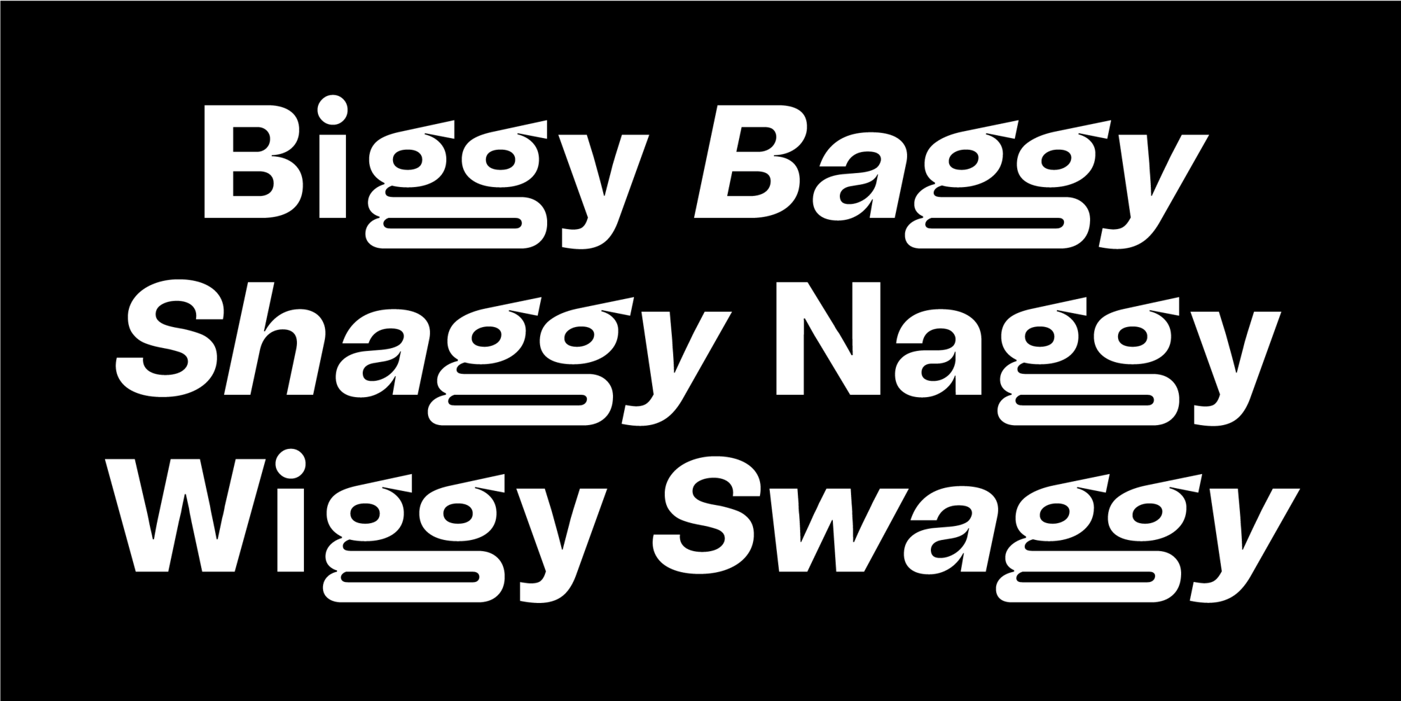
Right Grotesk from PangramPangram
For a typeface that has versatility, it also brings personality with its ink traps, slightly unusual anatomy, and variety of styles.
“Not trendy, not timeless either, it was designed to be a versatile and high-quality type family for both serious and fun projects ▲ It was designed to be just Right.” - PPF
Coniferous from Oh No Type Co
A good script font is hard to find. A good, friendly, legible, and fun one… even harder.
“Coniferous is based on the signage at American National Forests that say, “National Forest.” - ONTC
Elaine’s Picks (Designer)
Armag from Blaze Type
Sharp, and I’m not only talking about its horned letterform.
“Inspired by early 20th century hand drawing, Armag is a family of two fonts (Fury & Fury Italic) with aggressive and evilish looking endings and, yet, generous organic shapes.” -Blaze Type

Gela from Polytype
Funky contrast - check. Playfulness - check. Leaning counters - Oh Yeah, check check check!
“Inspired in-part by the funk and flare of 70s typography, Gela brings together naive blobby forms and confident incised details, with a laid-back attitude.” - Polytype
Xiaoxiao’s Picks (Designer)
Niven from Typeverything
Elegant with an amazing set of “swash” variants for all the flair in the world.
“Niven is a new elegant display serif inspired by the movies of David Niven. Capable of a wide range of language options” - Typeverything

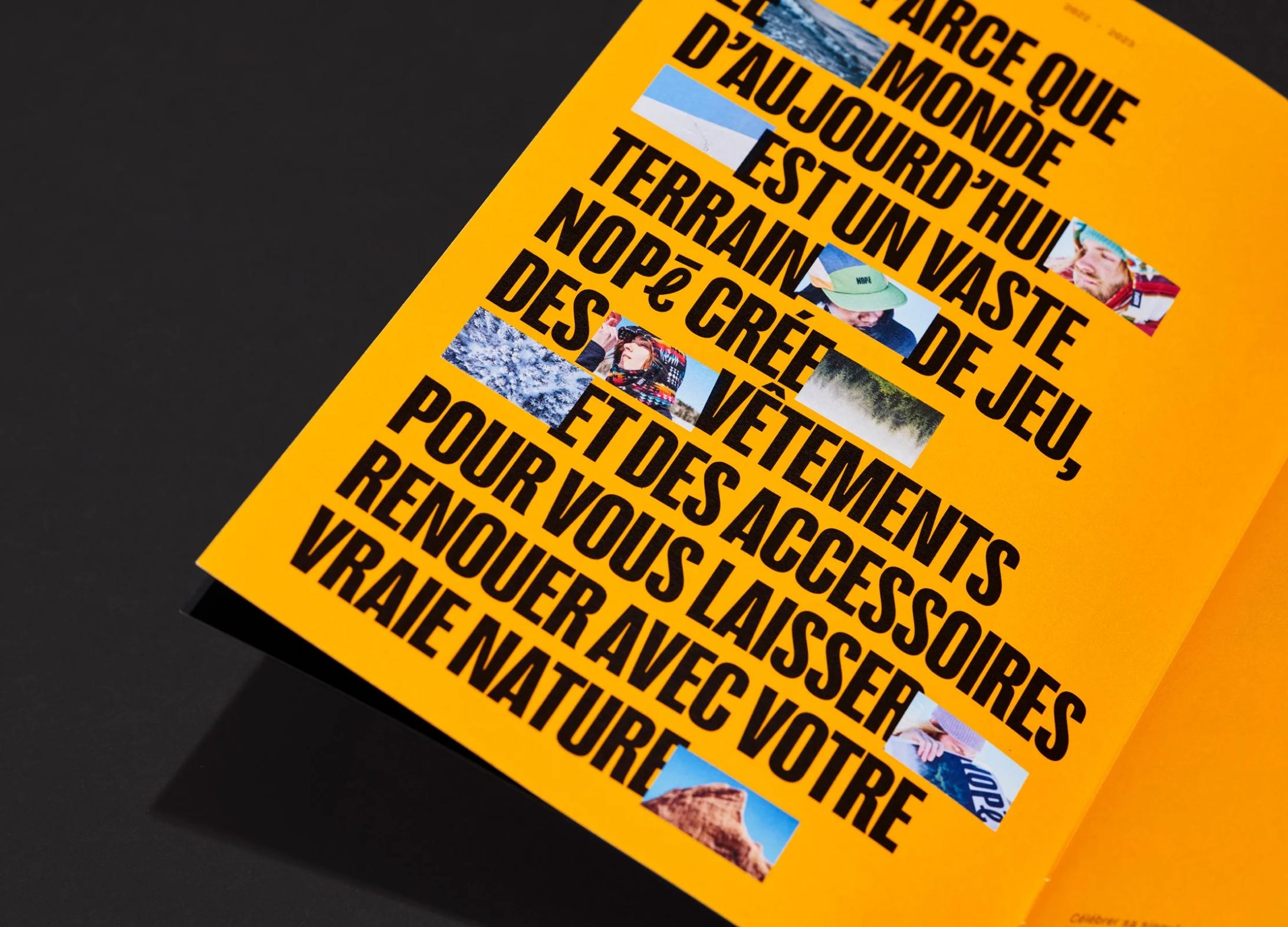
Nouvelle Grotesk from Nouvelle Noire Type Foundry
You can’t go wrong with a good Grotesk, and this is one of those.
“Do we need another “Helvetica”? “Yes!”, says Anton Studer and creates “NN Nouvelle Grotesk” to push the boundaries of the Swiss Style grotesque genre out of “neutrality”.” - nouvelle noire


Sol’s Picks (Jr. Designer)
Puzzler from Emigre
Hey, not all Fonts are about letters. Some are about glyphs, shapes, and patterns.
“With Puzzler, Zuzana Licko revisits and expands upon some of her earlier forays into decoration and geometric constructions of abstract elements.” - Emigre Fonts

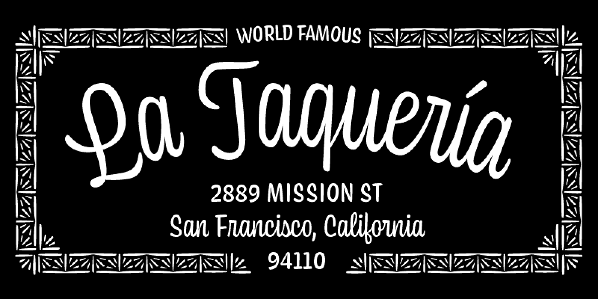
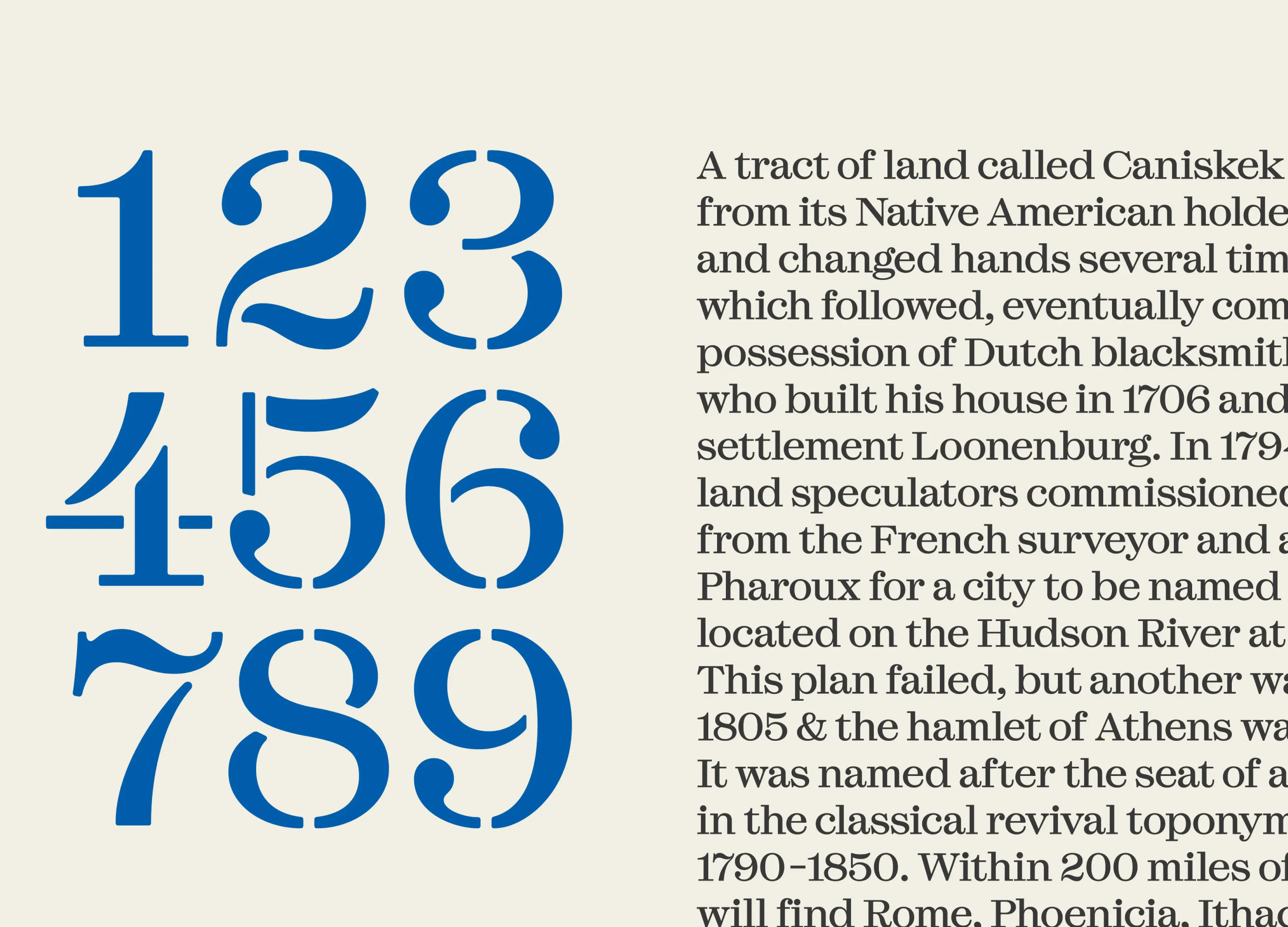
Esperanza from Labor & Wait
Historical but modern, with a great Stencil variety that makes it unique and oh so useful.
“The design was inspired by the lettering stamped into stoneware manufactured there(Athens Cultural Center) throughout the 19th century at the Athens Pottery Works by Nathan Clark Senior and his partners and descendants.” - Labor and Wait
That’s a wrap
There you have it, design gift-givers – your cheat sheet to typography gold. Armed with these font recommendations, you'll go from "meh" to "designer hero" in seconds flat.
Let us know in the comments if there’s one font that made your heart skip a beat. Or, what's been on your typography wishlist?
Pro tip: Screenshot and share with that friend who never knows what to get you.
Until next time, Happy Gifting from the Noise 13 team.

 | A guest post by
|
Central Avenue and Gela were big “oh yeah!” For me.
I'm searching for the right place to use Central Avenue and I love the punctuation marks in the Gela font.